Radix Themes 3.0
New layout engine, new components, and custom color palette generator.
Introduction
Radix Themes 3.0 just landed. This release is a big leap towards making Radix Themes the best component library for building modern apps. We’ll present the main highlights in this post.
For the comprehensive changelog and a migration guide, see the release notes.
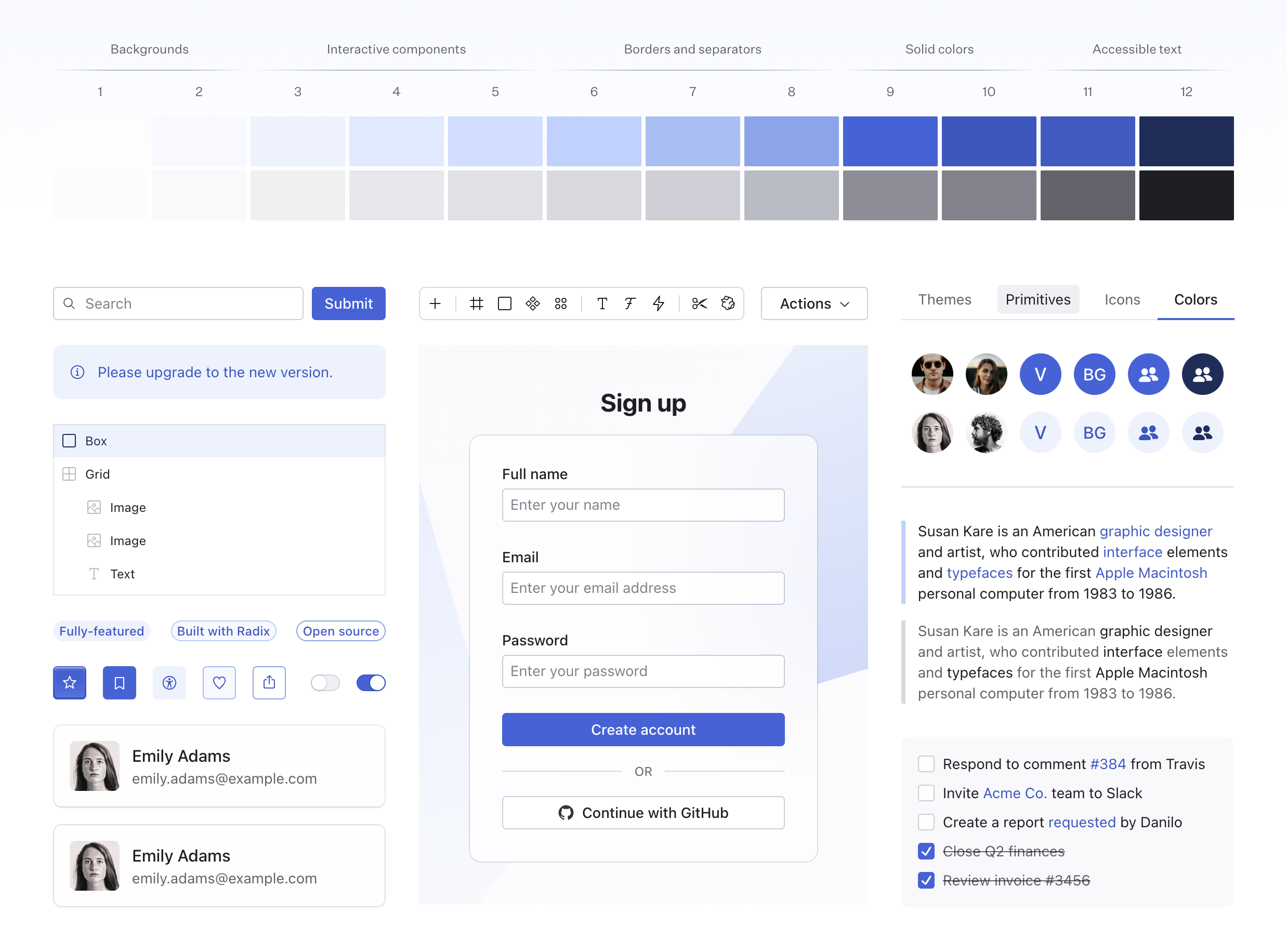
Custom color palettes
Radix Themes comes with almost 30 color scales, each with their own light, dark and alpha variants. Under the hood, the color system is powered by Radix Colors.
Every scale has been tuned to provide fully accessible contrast ratios, each with steps that correspond to backgrounds, interactive components, borders and text. Offering the most beautiful and intuitive color system you’ve ever used.
Today, we are introducing a new tool which allows you to create your own brand palette for Radix Themes. It’s a simple interface that lets you specify a primary color, a gray color, and your page background, generating a color configuration to copy-paste into your theme styles.
New components
Radix Themes 3.0 introduces a number of new components for building dashboards and data-heavy interfaces. They are built and designed with the level of rigor and care that you’ve come to expect from Radix, and as usual, they are accessible to keyboard and screen reader users. Here’s a quick overview of the main highlights.
Spinner
Spinner is a simple animated loading indicator:
It comes with an intuitive API to conditionally render its children when they are done loading. Consider the following example:
The implementation looks effortless—the way it should be. Spinner preserves child dimensions while the data is being fetched, so there is no layout shift between the states. This is an ergonomic way to handle loading states in your app because it minimizes the amount of code branching needed in common situations.
Skeleton
Skeleton is another loading component in this release:
Skeleton has a similar API to Spinner, but it also fully adopts the shape and size of child components, so you can build the skeleton interface using exactly the same layout that you’d use in the real one:
Segmented Control
Segmented Control carries a familiar design for toggle buttons that switch between values:
Segmented Control packs many details that were crafted to be invisible. For example, a bolder font weight is used on the active item, yet there is no layout shift, and the animation is dialed in so that even the font weight change transitions smoothly. Here’s the same demo slowed down:
Data List
Data List is a component for displaying a list of key-value pairs:
- Status
- Authorized
- ID
u_2J89JSA4GJ- Name
- Vlad Moroz
- vlad@workos.com
- Company
- WorkOS
What’s special about Data List? It is a common pattern that is deceptively tricky to get right. We had to put together a secret page with all the different layout combinations as we designed for:
- Values of varied length
- Consistent rhythm between mixed height items
- Configurable alignment of the label and value
- Common layout compositions within
- Leading trim
Reset
Unlike others, Reset is an invisible component:
Reset removes default browser styles from any HTML tag and sets idiomatic layout defaults so that you can build your custom components on top of it.
In most interfaces, these styles are global and affect the entire app, so that tends to be a compromise between removing as much as possible and retaining common defaults. Reset puts a new spin on the ergonomics of the normalization styles that almost any website needs.
Radio Cards
Radio Cards is a common pattern for picking a single value out of multiple. They are used for visually engaging forms where each options gets more weight compared to a regular radio button:
Checkbox Cards
Checkbox Cards are similar to Radio Cards, but are used for picking multiple values:
Progress
Progress is yet another loading component. It can be used to indicate the progress of a task, or use an ambiguous animation to indicate indeterminate progress:
Tab Nav
Tab Nav is a component for navigating to a different view. It complements its lookalike Tabs sibling, but it is built on top of the Navigation Menu primitive which provides screen reader accessibility and keyboard navigation tailored to links.
New layout engine
A new engine makes layout components and their props more powerful and easier to use.
Layout components are a cornerstone feature of Radix Themes. There are just five of them—Box, Flex, Grid, Section, and Container. These components are used to separate layout responsibilities from content and interactivity. When you separate layout concerns from content and interactivity, the compositions you create are more maintainable and easy to reason about.
These components allow you to quickly add structure to views, pages and other interactive elements within your application.
You can learn more about layout components and their props in the Layout guide.
Better layout props
In this release, layout components have received a number of new props and the values they accept have been significantly reworked:
- 9 new props for working with flex and grid layouts
- 4 new props for controlling the dimensions of layout components
- In addition to space scale values, all layout props now accept valid CSS values, including when used with the responsive object syntax.
Responsive object syntax
In Radix Themes, responsive object syntax is how you build a responsive layout at different breakpoints without leaving the React code where you compose your app itself.
Consider the following piece of code:
This would create a flexbox layout that’s 500px wide. But what if you wanted to use a different width on mobile? This is possible using the responsive object syntax, where you can specify the value to use at a particular breakpoint:
Now, in addition to space scale values, layout props will support valid CSS values. For example, 100px, 50vw, or even expressions like calc(100vw - 200px) can be used at specific breakpoints.
However, does it perform well? Does it work with server components? Well, here’s how the above <Flex> element gets actually rendered into the DOM:
You can see how that the <Flex> element was compiled into a combination of utility classes and CSS custom properties. There is no runtime evaluation of the breakpoints, which means the performance is just like vanilla CSS and the component can be rendered on the server.
The best of both worlds
Altogether, there are 5 layout components with almost 40 props each. Together they form a system that is easy to learn, quick to master, and sets an incredibly high ceiling of what you can achieve without switching between files and losing momentum.
If you have never used such a system, we’d suggest you give it try. It is a great alternative to Tailwind, which is an incredibly powerful tool originally built for the same purpose—layout. However, today it has evolved into an entire styling paradigm that does not discourage you from creating complex styles on the fly, which can violate the separation of concerns mentioned earlier.
Radix Themes layout comes with the full power that utility class frameworks may provide for layout, but it’s also type-safe and guides the developer in maintaining a clear boundary with the other pieces of the interface that they are building.
Standalone layout components
If you want to use just the layout component from Radix Themes, that’s also possible. Just make sure that JavaScript tree-shaking works on your side, and import the layout essentials CSS:
Zero config setup with Astro and Remix
Radix Themes is now much easier to set up with Remix and Astro. In 3.0, we have revisited the way the library is built to ensure support for ESM environments out of the box.
The distribution is now a hybrid ESM/CommonJS package. Depending on your setup, your import resolver will now pick the right version automatically.
Contributors
Radix Themes 3.0 is the result of the hard work of many contributors. We’d like to thank everyone who has contributed to this release, whether through code, documentation, design, or community support.
Special thanks to Alasdair McLeay, itsMapleLeaf, and Sora Morimoto.